
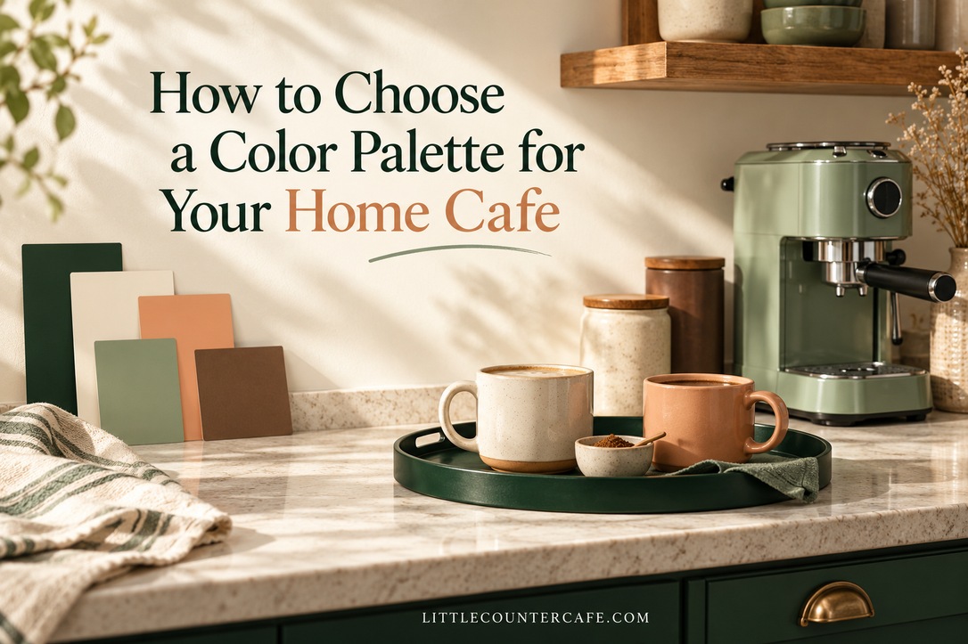
A home cafe can feel pulled together without matching every mug or repainting the kitchen. Start with the colors you already have, choose one color you love, and give it a small, useful place to live. A tray, two favorite cups, and a tea towel can be enough.
I love coffee, and having my own little counter cafe makes that first cup before work feel special. For this kind of corner, I favor a palette that is easy to maintain: everyday pieces doing the decorating, with enough clear counter left to actually make a drink.
This guide will help you choose a background, a supporting color, and an accent; compare them in your kitchen; and decide what to keep or buy. The pictured setups are styling inspiration, rather than measured examples of a real kitchen makeover. Use the printable palette worksheet to make your own plan.
Start With the Colors Your Kitchen Already Has
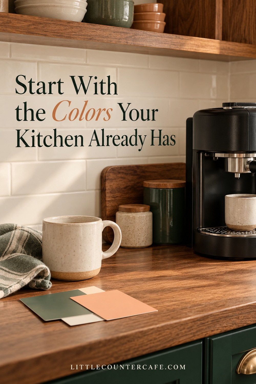
Before saving more inspiration pictures, stand where you usually approach the coffee corner. Look at everything visible behind and beside it: the counter, backsplash, cabinet doors, hardware, and the coffee maker or kettle you intend to keep. These are the starting palette, even if they are not the colors you would choose from scratch.
Write down three fixed finishes. Be specific enough to be useful: “cream tile with a yellow cast,” “cool gray counter,” or “medium brown wood.” A black machine also counts. Its dark shape may be a major part of a very small station, so repeating black in one small item can help it feel intentional.
Sherwin-Williams recommends beginning a color scheme with permanent room features, including cabinet and tile finishes. For a counter cafe, that means working with the kitchen before choosing the accessories. You do not need to change a perfectly useful appliance to match an inspiration board.
Now gather what you already own. Put your favorite mug, a tray, and a folded cloth near the station. Remove packaging and extra decorations temporarily so you can see the combination. This is an editing exercise, not an instruction to replace your kitchen essentials.
Choose a starting point that suits your circumstances:
- Warm wood and cream cabinets: try a warm neutral base, a muted green supporting color, and one soft peach or rust accent.
- Gray stone and stainless steel: try an off-white base, a blue-gray or soft sage supporting color, and a dark outline from the appliance.
- A colorful machine you want to keep: let its color be the accent, and make the smaller pieces quieter.
- A rental kitchen you cannot alter: put the palette into removable, useful items such as mugs, a washable cloth, and a freestanding tray.
These are possible combinations, not rules about what particular kitchens must wear. Keep any favorite piece that makes the corner feel like yours. If you still need to settle the location, visit Coffee Corners before buying accessories for a spot that may move.
Give Each Color a Clear Job
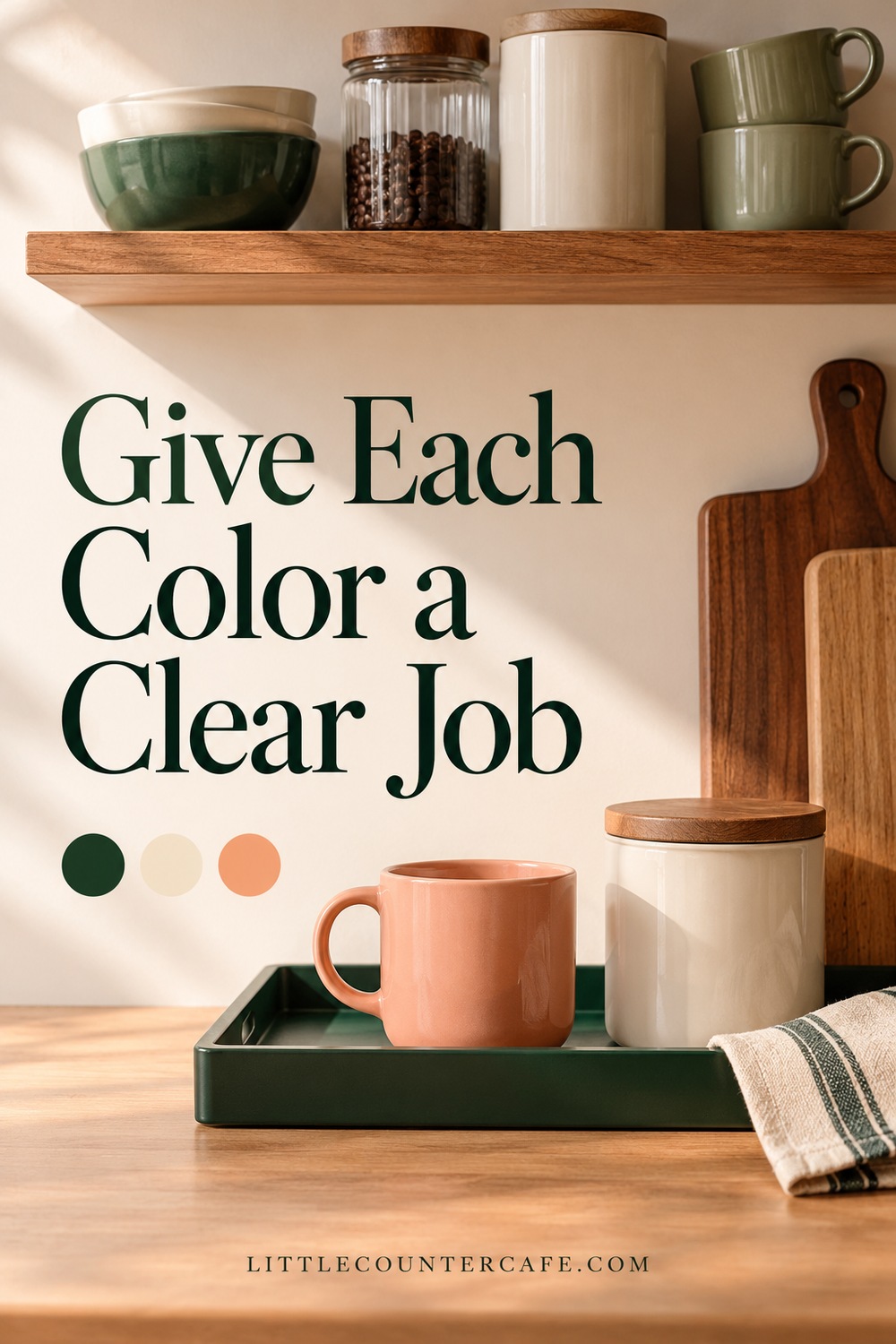
Instead of asking whether five attractive colors “go together,” decide what each one will do. A simple three-part plan is easier to shop from and easier to edit later.
The background is the largest quiet surface: often the existing wall, backsplash, cabinetry, or counter. You may not buy anything in this color because your kitchen already supplies it.
The supporting color appears in one useful piece or a small group. Think of a forest green tray, sage storage container, or pair of cocoa-colored mugs. It should connect the station rather than fill every gap.
The accent is the smaller detail you notice: a peach cup, a narrow stripe on a towel, or the binding on a little recipe notebook stored away from splashes. Keep it easy to change if you like seasonal updates.
Sherwin-Williams describes the familiar 60–30–10 approach to balancing a dominant, secondary, and accent color. Treat that as a loose visual prompt here, not a requirement to measure colored square inches or buy three sets of accessories. On a tiny counter, the backsplash may supply most of the background and one mug may supply the entire accent.
Try one of these illustrative starting palettes:
| Palette | Background | Supporting color | Small accent | A useful first change |
|---|---|---|---|---|
| Garden cafe | Cream | Sage | Cocoa | Use a sage cloth with the wood tray you already own. |
| Soft contrast | Warm off-white | Forest green | Peach | Add one peach mug beside a green tray. |
| Quiet coastal | Soft white | Muted blue-gray | Natural wood | Repeat the wood of an existing scoop or tray. |
| Warm minimal | Oatmeal | Cocoa | Terracotta | Keep the mugs neutral and add a narrow terracotta stripe. |
The names describe color families, not exact paint formulas. Wood, stainless steel, clear glass, and black appliance details can sit alongside the three-part plan without needing separate matching purchases. If a patterned mug already contains several colors, choose one of those colors to repeat and let the mug do the rest.
For a calmer result, keep the supporting shade close to the background in intensity. For more contrast, use a darker tray or mug against the lighter kitchen surfaces. Neither choice makes the counter physically bigger; the aim is a combination you enjoy seeing and can use comfortably.
Compare Samples in Your Everyday Light
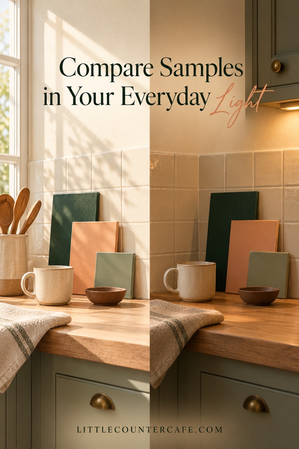
The palette that works on a phone screen may look different beside your backsplash. Before committing, compare real objects or samples in the actual corner, with the appliances in place. Benjamin Moore explains that natural and artificial light can change the way undertones appear and recommends evaluating paint samples under the lighting conditions where they will be used.
For accessories, place the mug, fabric sample, or tray beside the fixed finishes. For paint, follow the paint manufacturer's sampling instructions and compare the sample where you intend to use it. Do not treat a printed worksheet or a screen swatch as a reliable paint match.
Check your short list at the times you use the station. If the morning cup happens before sunrise, the under-cabinet lighting matters as much as afternoon daylight. Take a second look when the rest of the kitchen lights are on. You do not have to change the lighting to complete the palette; choose a combination that works under the conditions you already have.
Use the worksheet to note three things at each check: which color looks too yellow or too cool, whether the accent still stands out, and whether you still like the combination beside the machine. A photograph can help you remember the arrangement, but make the final decision while looking at the real pieces.
If something feels wrong, change one thing at a time:
- The cream looks unexpectedly yellow: compare it with the backsplash and another off-white before buying more of it. A different neutral may sit more comfortably with the fixed finishes.
- The station feels flat: try one darker useful item, such as a mug or tray, rather than adding several more colors.
- The accent seems too loud: reduce its area. A small detail may work where a whole tray does not.
- Two greens compete: try keeping one green and using a neutral for the other item. Exact matching between glazed ceramics, fabric, and paint is difficult to judge online.
- Everything looks different at night: make the night version part of your decision. That is a real use condition, not a failed choice.
Keep two finalists at most. Testing ten similar neutrals at once can make the decision harder to see. You can also decide that your existing mix works well enough and stop there.
Finish the Palette Without Filling the Counter
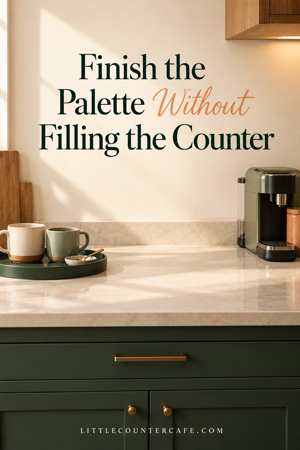
Once you like the colors together, give every visible item a job. The tray can gather the cups, the cloth can catch routine drips, and the storage container can hold supplies you actually use. A tea drinker can use the same approach with a teapot, tea tin, and favorite cup; the corner does not need an espresso machine to feel like a cafe.
Start with what you own, move one item from elsewhere in the house if it helps, and make a short shopping list only for the remaining gap. Write a spending limit on the worksheet before browsing. There is no minimum spend and no need to replace a mismatched mug that you reach for every day.
Leave the appliance's operating space clear. Follow its own instructions for placement and ventilation, and keep fabrics, paper, plants, and decorations away from hot surfaces and steam paths. A tray intended to corral cups should not automatically become a base for an appliance; check the appliance instructions and the tray's suitability first. Keep the area where you fill water and set down a hot drink available.
For accessories, consider how the finish fits your routine as well as how it looks. Check the item's care information before choosing delicate surfaces or pieces that cannot be washed the way you expect. Store spare supplies elsewhere if displaying them makes the little corner harder to wipe down. Cafe Essentials is a useful place to continue planning the practical pieces.
If you want to browse decor ideas, the curated category collection below is optional. This article contains affiliate links. As an Amazon Associate I earn from qualifying purchases. Choose a piece because it solves your remaining need, rather than adding something simply to complete a color ratio.

LITTLE COUNTER CAFE · Cozy Coffee Corner Decor
Give your coffee corner a little café charm.
Warm accents, attractive mugs, trays, and practical styling pieces for a welcoming coffee corner.
As an Amazon Associate I earn from qualifying purchases. This is a paid link.
Your final palette check:
- I have listed the finishes and appliance I am keeping.
- My background, supporting color, and accent have clear roles.
- I have checked real samples or objects in my everyday lighting.
- The cups, tea supplies, or tools I need remain easy to reach.
- Appliance clearance and working space come before decoration.
- My buy list has a limit, and I know what I can reuse instead.
Use the printable worksheet to record your final colors, morning and evening notes, and a keep/move/buy plan. If your choice is still uncertain, live with the items you own before committing to a new finish. A home cafe should make your everyday cup a little more enjoyable, with a palette that belongs in the kitchen you have.