

A peach mug beside a sage tea tin can be enough to give your coffee corner a spring feeling. You don't need a new machine, a row of matching canisters, or a counter full of decorations. Start with one soft color you enjoy, repeat it in something useful, and leave yourself a comfortable place to make a drink.
I love the idea of a little counter cafe that feels inviting before the day gets busy. For this spring refresh, think about the pieces you reach for: a mug, a tea tin, a spoon rest, perhaps a small tray. Those everyday items can carry the color while the rest of the kitchen stays familiar.
Below are three pastel combinations and practical ways to use them on a modest counter. The pictured arrangements are concept illustrations for inspiration, rather than measured installations. Use your own appliance instructions and the printable planner to check what works in your kitchen.
A simple starting point: choose one pastel pairing, take out the pieces you already own, and try a single arrangement before buying anything. As an Amazon Associate I earn from qualifying purchases. Relevant shopping links below are paid links.
Try Three Pastel Pairings With Pieces You Own
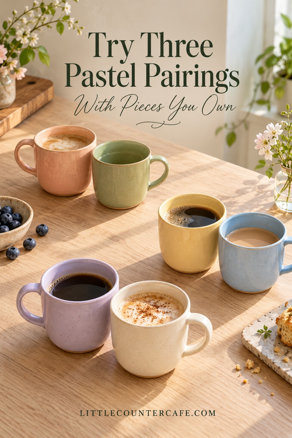
Pastels don't have to mean a rainbow of accessories. Two soft colors, the kitchen's existing surfaces, and a little breathing room can create a more settled look. Treat these combinations as suggestions to adapt, rather than a shopping list to complete.
Peach and sage: warm and quietly botanical
Try a peach mug with a sage tin, or reverse the colors if your favorite cup is green. Cream ceramics and natural wood can connect the two without adding another competing accent. This pairing is especially easy to try when you already have a warm wood shelf or a cream backsplash.
Begin with the mug you actually drink from and a container you already need. If that gives you enough spring color, stop there. A pale peach dish can hold a teaspoon; it doesn't need an extra ornament beside it. Keep everyday coffee in appropriate storage, rather than decanting it into a decorative container solely for its color.
If the peach seems too bright, try a smaller piece or a dustier shade. If the sage disappears against a green wall, use cream between them or choose a mug with a more noticeable difference in lightness. You can make the combination work without repainting anything.
Butter yellow and powder blue: light and cheerful
A soft yellow cup and a powder-blue teapot make a lovely starting point for a tea-friendly corner. Keep the surrounding pieces simple: a plain cream tin, an existing wooden tray, or your usual stainless-steel kettle. The kettle doesn't need to match the cup.
For a coffee setup, put the yellow in the mug and blue in a small saucer or spoon dish. If your counter already has a strong yellow or orange cast, compare the pieces directly against it before committing. A yellow that looks gentle in a shop may feel quite different next to your own surfaces.
When the combination feels too busy, let one color do most of the work. A blue cup with one small yellow detail will often be easier to live with than equal amounts of both colors scattered across the counter.
Lilac and cream: soft color with a simple backdrop
A lilac cup against cream ceramics offers a quieter alternative to floral decorations. It can also sit comfortably beside a black coffee machine, particularly when the lilac is repeated once on the other side of the arrangement. That repeat might be another cup you use, rather than something purchased just for display.
Keep the lilac close to the drink-making items so it reads as a little collection. You don't need lavender flowers, scented candles, and a purple sign to explain the color. A plain cream sugar bowl, if you use one, is plenty of company.
Look at all three combinations in your own light. Sherwin-Williams explains that undertones and lighting affect how colors appear; its guide to understanding undertones is useful background when two apparently similar pale shades don't sit well together. Comparing your actual cups and tins at breakfast time and under your kitchen lights is a practical next step. These accessory pairings are editorial suggestions, not a manufacturer-approved matching system.
Place Color Where It Helps Your Morning
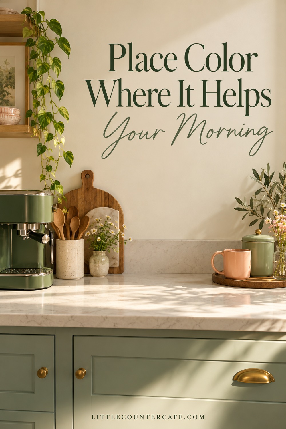
Give the pastel pieces useful jobs. Your daily cup can be the focal point. A closed tea tin can supply the second color. A small dish can collect the teaspoon after stirring. Once those jobs are filled, consider whether you need anything else.
Start by making your normal drink with the counter arranged as usual. Notice where you set the mug, where the water goes, and where you reach for tea or coffee. Place color around that routine. A pretty tray in the middle of the only pouring space will become irritating quickly, even if the photograph looks lovely.
Keep the machine on a suitable surface
Style around the equipment without covering its vents, controls, refill points, or working surfaces. Follow the instructions for your actual model. For example, the Breville Barista Express Impress instruction book specifies a stable, heat-resistant, level, dry surface away from the edge and says not to operate that machine inside a cupboard. It also addresses keeping the cord away from hot surfaces and counter edges. Those are model-specific instructions, not a universal clearance measurement for every brewer.
Keep fabric accents away from the appliance and hot parts. A folded pastel cloth can live in a drawer until needed; it doesn't need to become a permanent mat under the machine. Don't cover appliance surfaces with decorative film or paint as part of this refresh.
Use a tray for accessories, if it helps
A small tray can give a mug, tin, and spoon dish a shared home. Check that it is stable, suited to its intended use, and easy to lift without catching a handle. Keep the appliance directly on the surface its manual requires unless its manufacturer permits your proposed arrangement.
If you must move the tray every time you refill the machine, make it smaller or take it away. Grouping useful pieces on the bare counter is equally valid. For more help with what deserves a place, see what to keep on a coffee counter and what to put away.
For a shared coffee-and-tea station, let the same palette connect the two drinks. A peach coffee cup and a sage tea cup can belong together without duplicate trays and separate decorative displays.
Make a Tiny Counter Feel Finished
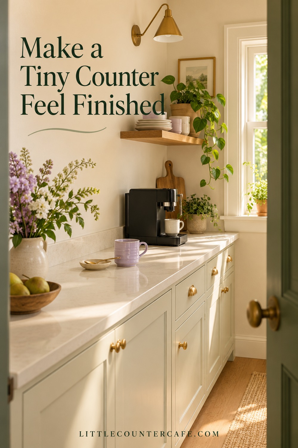
On a very small counter, a finished look may mean fewer visible items. Use a single pastel mug as the spring detail, then put it away after washing. A seasonal corner can change with the drink you're making; it doesn't have to remain staged all day.
Try one of these small arrangements
- One mug, one tin: set a peach cup beside a closed sage tea tin, leaving the remaining counter for preparation. Store extra cups in the cupboard.
- Tea for one: pair a butter-yellow cup with a powder-blue teapot on a suitable stable surface. Put both away after use if that surface is needed for meals.
- A dark machine with a soft accent: choose a lilac cup and cream spoon dish beside a black brewer. Leave space around the equipment and keep the dish out of the pouring path.
- A shared family counter: keep the seasonal cups on an existing shelf that is suitable for their weight, and bring them down when needed. Don't add new shelving just to accommodate a spring display.
These are styling possibilities, not measured plans. Open cupboard doors, lift the water-tank lid, remove the drip tray, and check your usual hand movements before settling on a position. If the equipment itself is awkward to use, the coffee-maker footprint guide covers a more thorough fit check.
Make existing pieces look intentional
If your cups don't match, give them one point in common. Two different shapes in similar pale greens can sit together. A peach cup can echo the warm tone of a wooden shelf. A blue teapot can supply the only cool accent among cream pieces. You don't need to conceal ordinary stainless steel or replace a perfectly useful machine.
When the counter feels washed out, add contrast with something you already own: a darker green tin, a cocoa-colored spoon, or a wood tray. When it feels crowded, remove an object before adding another color. Open space is part of the arrangement.
Skip seasonal slogans if you don't enjoy them. A small print on an existing safe display spot is optional; it shouldn't lean against hot equipment or interfere with sockets. The pastel ceramics can do all the seasonal work on their own.
Keep Your Spring Setup Easy to Live With
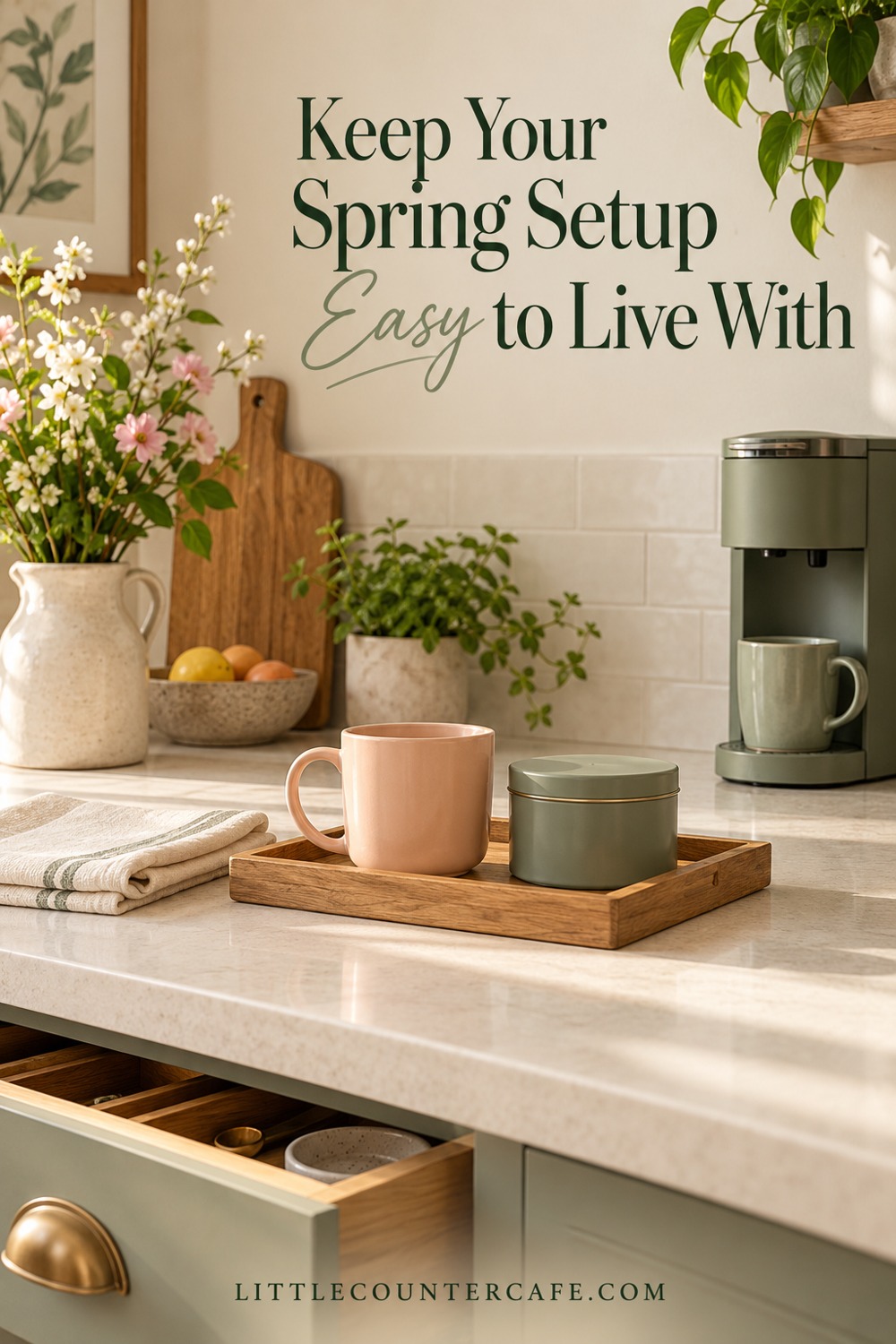
Before spending, use the printable pastel coffee corner planner. It has space for the pairing you want to try, the pieces you already have, the preparation space you need, and a short reset check. It is a planning worksheet, not a promise that every illustrated arrangement will fit.
Download the pastel coffee corner planner.
Try the arrangement for an ordinary morning. Does the cup lift out easily? Can everyone find their drink supplies? Can you wipe the counter without dismantling a display? Put back anything that makes the routine harder. You can still enjoy the color in a cupboard when the counter is needed for cooking.
Use a short reset
- Return ingredients to their appropriate storage and put extra cups away.
- Wash used drinkware and clean equipment according to its own instructions.
- Wipe the suitable counter surface using its recommended care method.
- Return only the useful everyday pieces, leaving the preparation area clear.
Don't use the styling tray as a reason to leave milk or other perishable ingredients on display. A pastel storage piece is only useful when it is suitable for what you intend to store. For empty decorative tins, keep them decorative rather than assuming they are food-safe.
Fix the small things that make the look awkward
The colors clash with the counter: try the smaller accent first, or put a cream item between two colors that compete. Compare them under your usual kitchen lights before buying a replacement.
The arrangement feels childish: simplify the shapes and use less color. One plain pastel cup with familiar wood and cream pieces can be enough; bows, novelty signs, and patterned accessories are optional.
The tray is always wet or hard to clean: check its care instructions and suitability. Reduce what you keep on it, dry it as directed, or remove it. Decorative convenience shouldn't create a maintenance problem.
You want every spring color: rotate your mugs through the week and keep one pairing visible at a time. You can enjoy the collection without finding permanent counter space for it all.
You have no budget for a refresh: wash and regroup what you own, bring forward a lighter cup, and put an unused decoration away. A new arrangement can be the entire change.
Choose the pairing that feels most at home in your kitchen, then let your routine decide how much stays out. A little spring color should make your morning cup more inviting and leave the counter comfortable to use.

LITTLE COUNTER CAFE · Seasonal Coffee Bar Styling & Drink Staples
Refresh your little café with the season.
Flexible styling pieces and drink-making staples to use across seasonal coffee menus and counter refreshes.
As an Amazon Associate I earn from qualifying purchases. This is a paid link.